20% OFF Foundry wide for a limited time ONLY! New releases, an interview, and more ...
| Rian Hughes' Device Fonts Celebrates their 30th Anniversary | |
Rian Hughes is known as a graphic designer, illustrator, novelist and sometime comics artist, but from his earliest days he has been a type designer and aficionado.
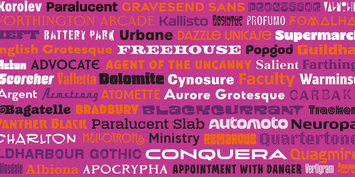
This year Device Fonts, his type foundry, is turning 30. From expressive pop culture fonts inspired by Rian's iconic logo designs for Marvel and DC Comics to eclectic revivals and ubiquitous workhorse sans, Device has always explored the endless creative possibilities of the alphabet. Today the foundry encompasses around 300 typefaces in more than 2000 weights and styles – if you've scrolled through Netflix, browsed in a bookshop or walked through a comics store, you've probably seen a Device font in the wild.
To mark this special occasion, Device is offering 20% OFF Foundry wide for a limited time. This includes the new expansions to popular families like Warminster, Guildhall and Ministry, and brand-new headline faces such as Bagatelle, Scorcher, and 'MyFonts Hot New Font' Carbak Sans, which are waiting for talented creatives to put them through their paces.
Also, be sure to read more below about the launching of Typeractive – a book collecting every font Device has ever released.
Celebrate 30 Years with Device - SAVE 20% OFF Foundry wide | |
 | | Device Fonts' 30th Anniversary Book | | |
Every font Device has ever released are being collected in TYPERACTIVE, a sumptuous hardback that features sample settings, complete glyph sets and behind-the-scenes articles, now funding on Kickstarter – be sure to tell all your type nerd friends about their project.
600-page hardback, showcasing complete glyphs sets, specially-designed type specimens, notes on process and background research, and hundreds of examples of type in use. | |
| | Fresh Arrivals & Updates | | |
Explore the fresh and distinct typography offerings in their latest font releases. Warminster captures the essence of English signwriting with its monolinear design and versatile six weights, enhanced by decorative styles and elegant cursive italics.
On the other hand, Vertigram brings a compact and rhythmic feel to the table with its obround sans design, inspired by mid-20th-century geometric fonts. The addition of a rounded variant, Vertigram Soft, provides a warmer touch. For those seeking a bold statement, Guildhall offers a heavy rectangular serif in multiple widths, ideal for eye-catching applications like film posters and brand logos.
Finally, Ministry offers an extensive 28-weight sans family, grounded in the historical British 'M.O.T.' alphabet, now reimagined with a comprehensive lowercase and italics for contemporary use. | |
| | Rian Hughes talks Font Design: | | |
What is Typeractive?
Device Fonts is 30 years old this year, so it seemed like a good milestone to commemorate with a big fat catalogue. The plan is to compile every font I've ever released, along with some background work-in-progress, examples of fonts in use, and articles on research and process. It's actually closer to 35 years if you include the early FontFonts I released through Neville Brody and Erik Spiekermann's FontShop. Or even longer, if you include the hand-drawn pre-digital one-off pieces made from Rotring pen and Rubylith. It all adds up to around 300 families and many more individual weights and styles, so "Typeractive" seemed like a good title. Type books are something of a specialist interest, so a Kickstarter seemed to be the best way to find an audience.
What have you learned in 30 years of designing fonts?
That you never know which families are going to become ubiquitous and which are still searching for their audience! Battery Park, for example, was taken from some stencilled lettering on the side of a plumber's van I photographed through the rainy window of a New York taxi. I realised I had pretty much every letter-shape I needed to produce a full alphabet, but it took me several years to get around to digitising it, and a few more to actually release it. I didn't think anyone would be interested, but it's gone on to become very popular – I walked past a Banksy exhibition in London last week that uses it. As you can imagine, the more restrained and versatile fonts tend to be the most popular – Korolev and Paralucent are steady sellers. But I also have more than a few experimental designs that are probably too niche for their own good, of which I've sold only a handful. Maybe their time has yet to come.
How do you approach a font design?
More often then not I have a requirement though my own design and logo design work for a typeface with a specific character, and there doesn't seem to be a specific font that already exists that fulfils the need. So I'll often begin with a general atmosphere I'm trying to conjure – a mood, an attitude, whether that be, say, reliable corporate solidity, or frivolous eccentricity – or even reliable frivolous corporate eccentricity. These tend to be the designs that find a ready audience, maybe because they fulfill a specific need. Those designs in which the idea is more technical – cropping the angle of an ascender at a specific angle, for example – though interesting exercises in their own right can lead to less useful results.
Aren't there enough typefaces out there already?
No, of course not – it's a bit like asking if there's a limit to human expression. As long as we have new experiences to communicate, we'll need new fonts. Do we have too many songs, too many works of art, too many new places to visit? We're very lucky that the alphabet is such a versatile invention, one that can be endlessly reimagined and reworked. Long may it continue. | |
| Celebrate 30 Years & SAVE 20% OFF Foundry wide! Shop all Device Fonts here. | |
| | | MyFonts Inc.
600 Unicorn Park Drive
Woburn, MA 01801 USA
The promotions featured in this email newsletter are only valid for purchases made online at MyFonts.com. MyFonts and MyFonts.com are trademarks of MyFonts Inc. registered in the U.S. Patent and Trademark Office and may be registered in certain other jurisdictions. Other technologies, font names, and brand names are used for information only and remain trademarks or registered trademarks of their respective companies.
Prices are shown in our standard currency (USD), may differ in other currencies, and may also be subject to change due to exchange rate fluctuations.
Helvetica® Now is a trademark of Monotype Imaging Inc. registered in the U.S. Patent and Trademark Office and may be registered in certain other jurisdictions.
©2025 Monotype. All rights reserved.
The text in this email is set in Helvetica® Now.
Unsubscribe | Preferences | Privacy Policy | View in Browser |  | | | |


Tidak ada komentar:
Posting Komentar