Mercatino: Loose, textured, and 50% off, plus Unexpected Typewriter, Creepy House and more...
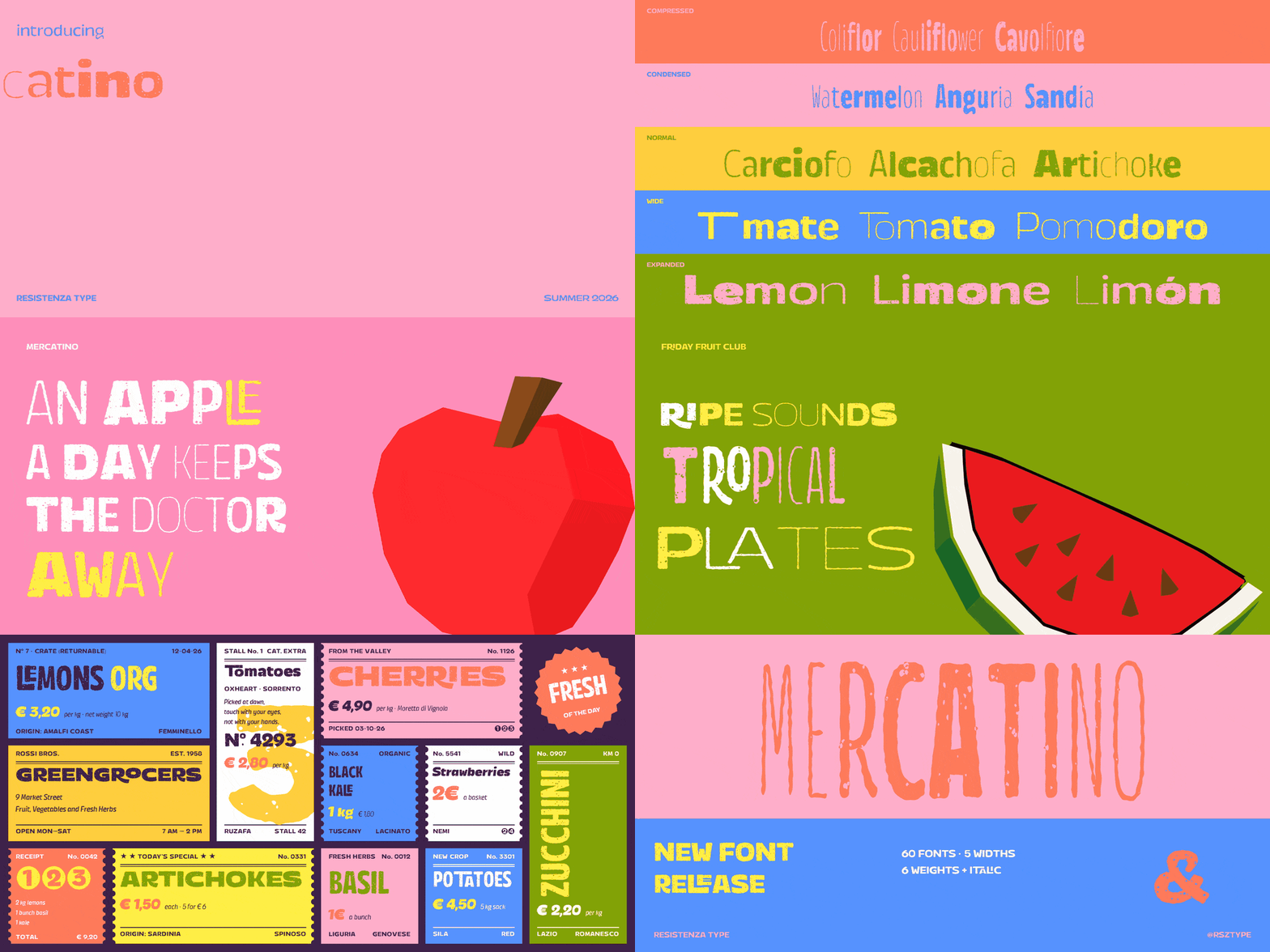
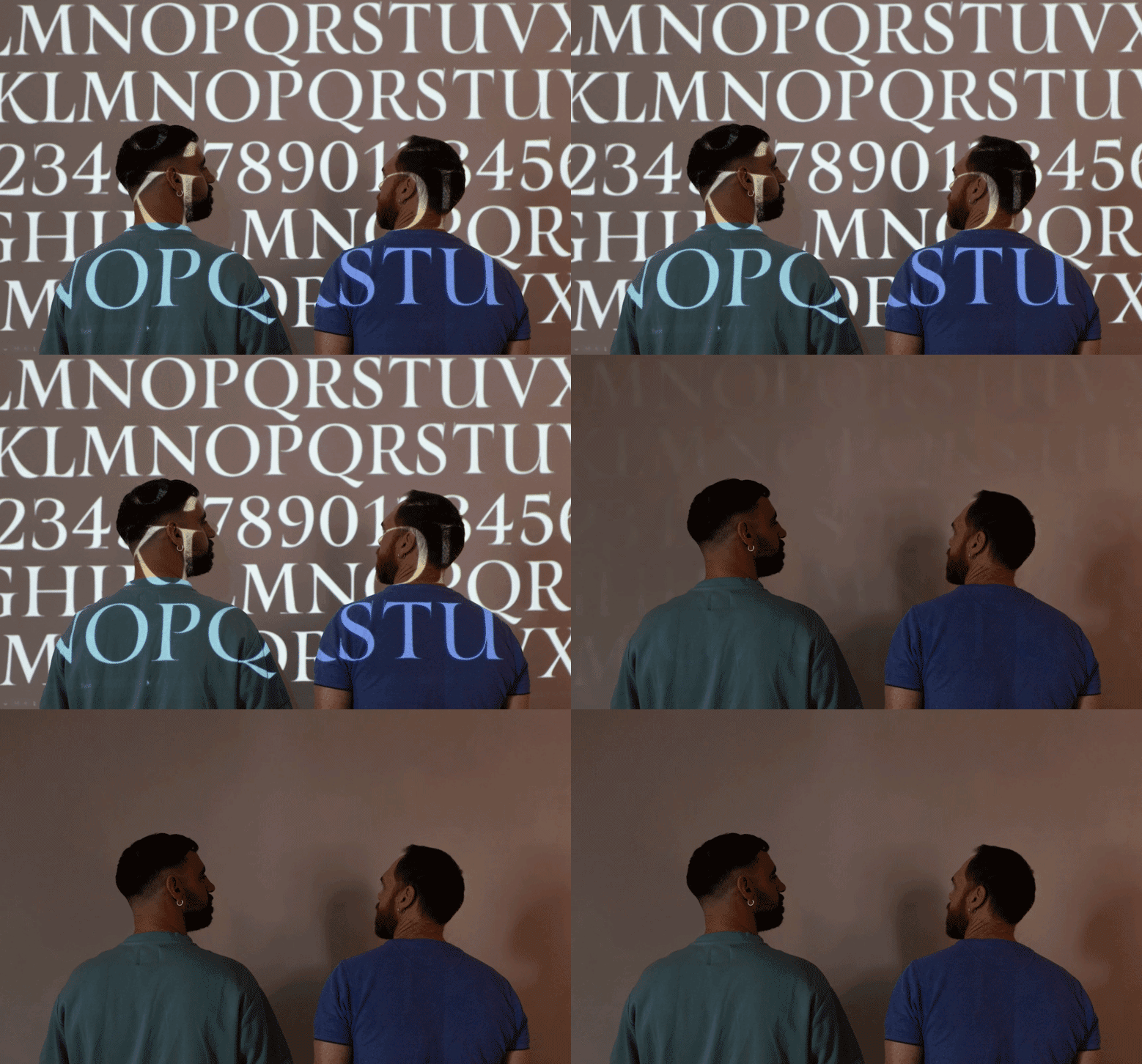
Mercatino takes its name from the Italian word for a small street market, and its letterforms come straight off a market stall: loose, textured, and built to be shouted from across the square rather than read up close. The family spans four widths (Squeezed, Regular, Wide, and Expanded) in weights from Thin to Black, set almost entirely in a forward-leaning italic, with a companion upright Squeezed style for steadier settings.
Key features
• Fine, grainy stroke texture throughout, closer to chalk or dry brush than a clean vector edge
• Connecting ligatures (LE, LI, RA, RI, RO, TA, Ti, To) that let letters run into each other like real brushwork
• A stylistic set (ss01) with looser alternate a and E
• Case-sensitive forms and ordinals
• Extended Latin character set for international use
Available styles
Regular (upright), plus italic weights Thin through Black across Regular, Wide, and Expanded widths.
Best uses
Market and food branding, packaging, editorial headlines, and posters. Playful enough to carry a logo, structured enough to set a whole layout.
“Give your brand a market voice.” — Giuseppe Salerno & Paco González
Introductory OFFER - 50% OFF
60 fonts for $240 $120 |
|
Resistenza specializes in type design, branding, calligraphy & lettering. Giuseppe Salerno and Paco González are the two founders, Italian and Spanish; their passion for writing and handcrafted lettering became their strengths. Brushy types, calligraphic strokes, and originality in faces are their best distinguishing characteristics.
Introductory OFFER - 50% OFF
60 fonts for $240 $120 |
|
 |
| Additional Noteworthy Fonts of the Week |
|
|
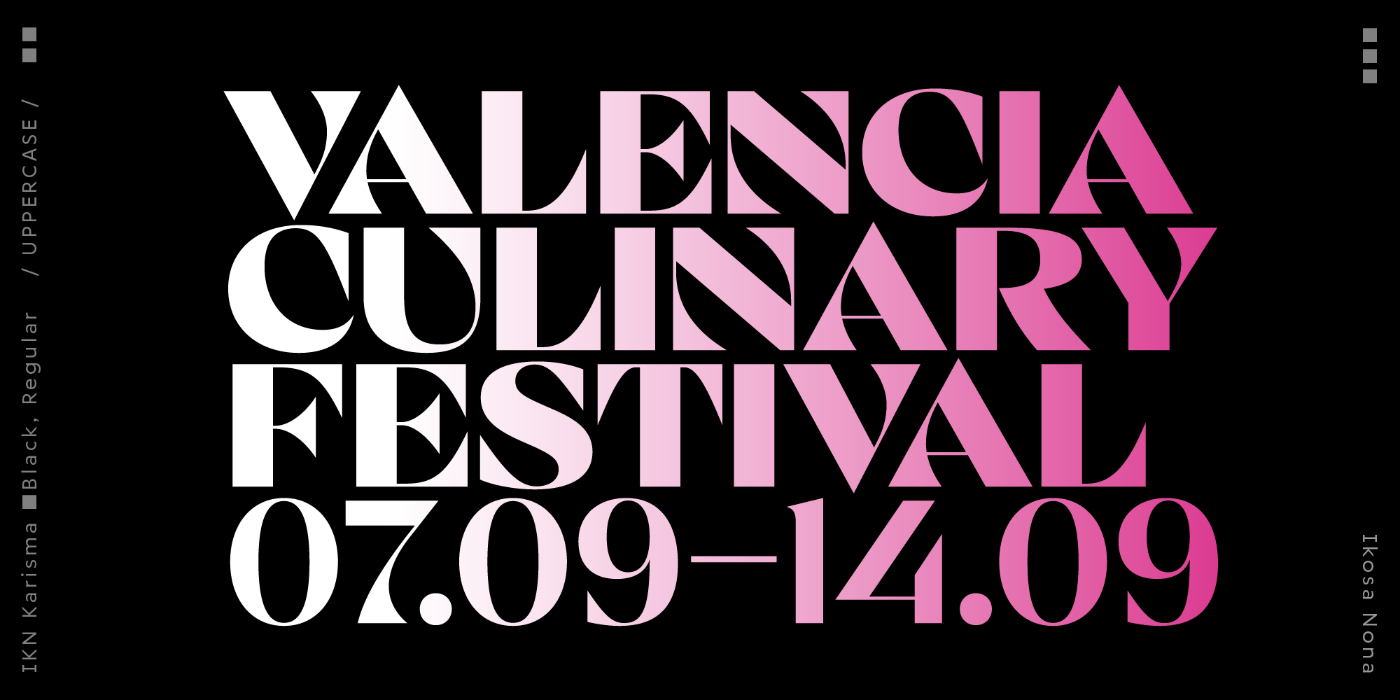
| IKN Karisma is a high-contrast display typeface that lives in the space between a serif and a sans. With sculptural curves, dramatic contrast and occasional inward-flaring serifs, it offers a compelling rhythm and a visually balanced texture. Inspired by the elegance of classic Didones but firmly rooted in contemporary design, IKN Karisma is playful yet refined, striking yet versatile. It brings its own brand of charisma to titles, headlines, subheads, branding, packaging and editorial use. |
|
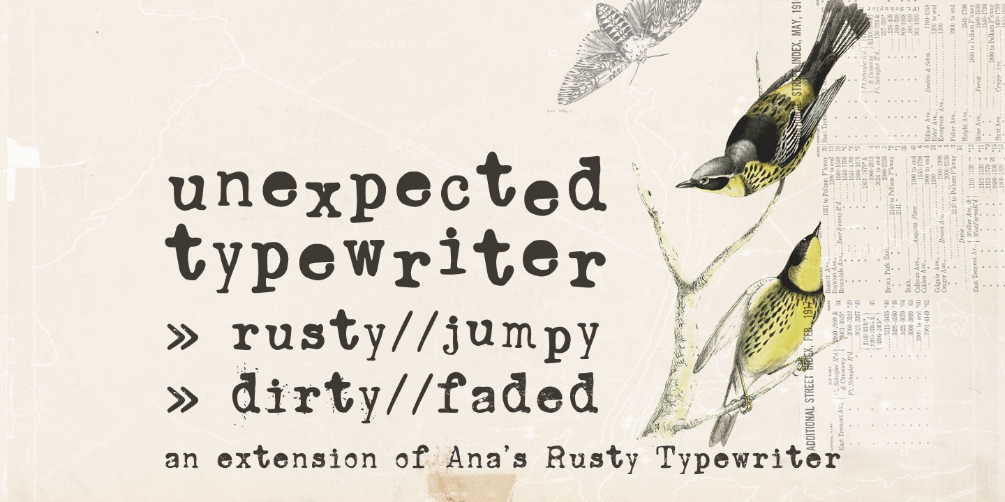
| Meet Unexpected Typewriter! A hand-drawn font inspired by the character and charm of an old Underwood typewriter. It includes 3 unique variations: Jumpy, Dirty, and Faded Typewriter, so you can easily create different levels of vintage, worn, and imperfect texture. Perfect for posters, branding, packaging, invitations, logos, and creative projects that need a nostalgic, grungy typewriter feel. |
|
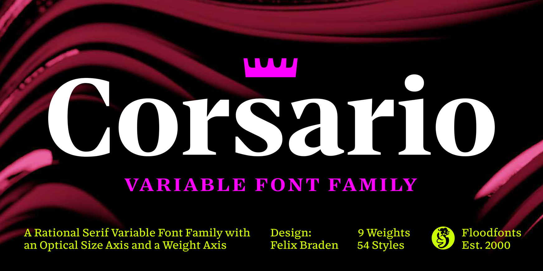
| Corsario is a variable font family with an optical size axis and a weight axis, tailor-made for the demands of magazines and editorial design, offering a unique blend of flexibility and style. |
|
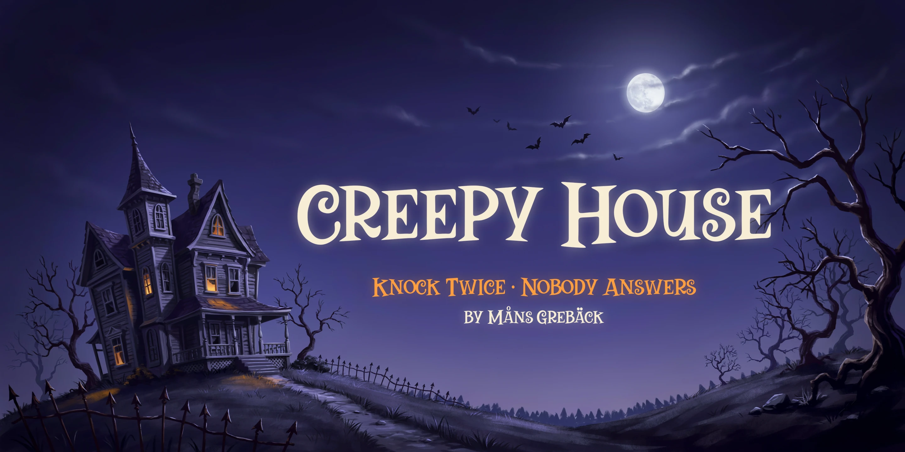
Creepy House is a bold, old-fashioned display serif with a quietly haunted personality.
The capitals have heavy, wedge-shaped serifs and a few letters that curl unexpectedly, like the G, S and the ampersand, while the lowercase is a set of smaller capitals that sits neatly beside them. The result feels like a vintage storybook cover with something not quite right inside.
The font is built with advanced functionality and guaranteed top-notch quality, containing stylistic and contextual alternates, ligatures and more automatic and manual features; all to give you full control and customizability. |
|
| Want more fresh arrivals? Shop ALL now. |
|
|
|
|
|
MyFonts Inc.
600 Unicorn Park Drive
Woburn, MA 01801 USA
The promotions featured in this email newsletter are only valid for purchases made online at MyFonts.com. MyFonts and MyFonts.com are trademarks of MyFonts Inc. registered in the U.S. Patent and Trademark Office and may be registered in certain other jurisdictions. Other technologies, font names, and brand names are used for information only and remain trademarks or registered trademarks of their respective companies.
Prices are shown in our standard currency (USD), may differ in other currencies, and may also be subject to change due to exchange rate fluctuations.
Helvetica® Now is a trademark of Monotype Imaging Inc. registered in the U.S. Patent and Trademark Office and may be registered in certain other jurisdictions.
©2026 Monotype. All rights reserved.
The text in this email is set in Helvetica® Now.
Unsubscribe | Preferences | Privacy Policy | View in Browser |
 |
|
|
|